Peak Mobile Web App

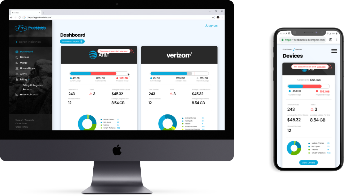
PeakMobile offers an extensive cell phone carrier and billing management platform. Their software aggregates usage data and allows companies to manage phone plans that their employees use. Their existing software has a poor navigational experience with many redundant user flows and unclear objectives. My task was to rework the entire software and accomplish 2 primary goals.

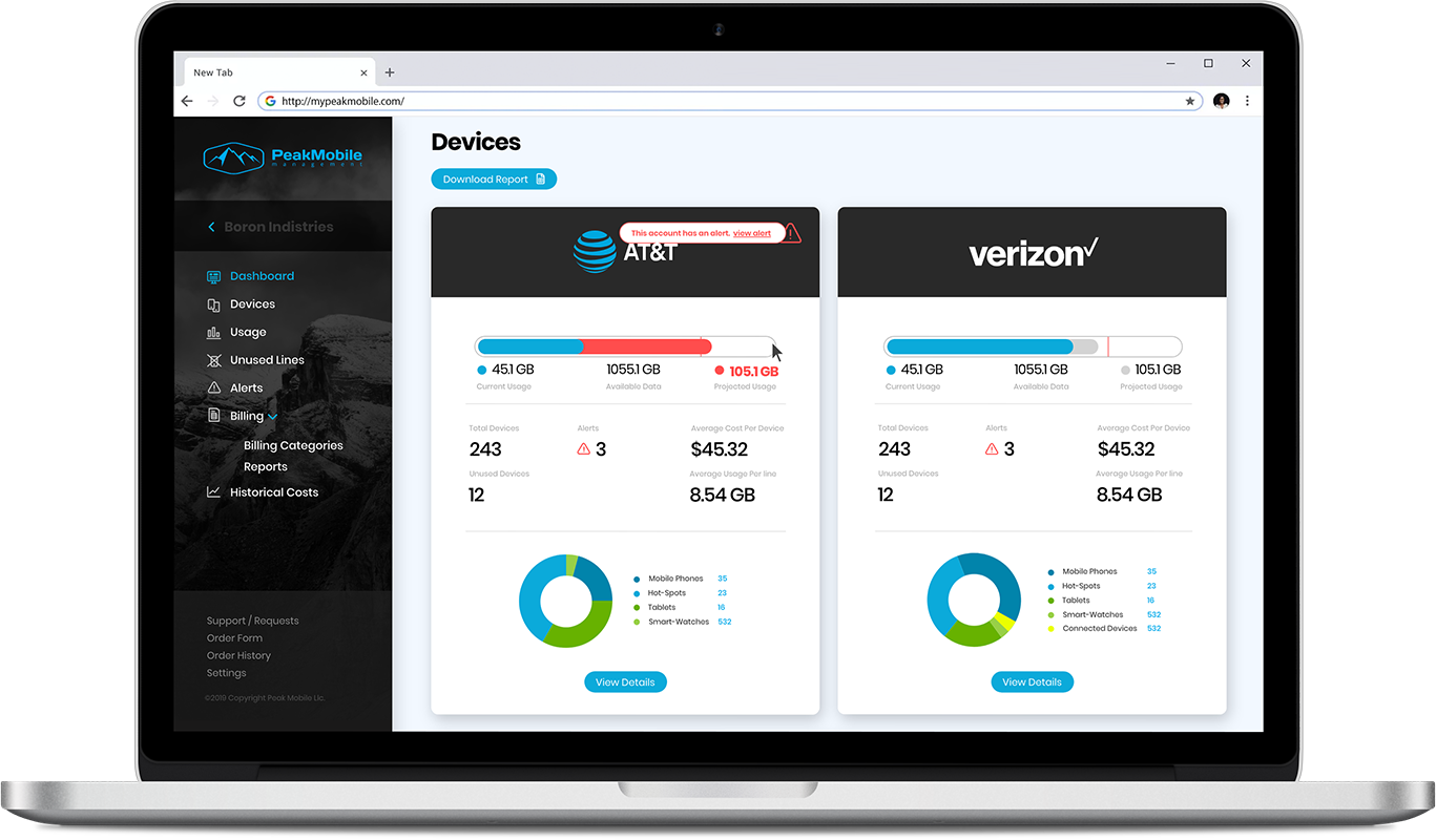
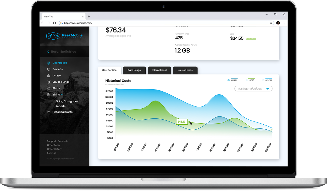
Goal 1. provide an experience where companies could easily and clearly see what devices on their plan were incurring the most unnecessary costs.

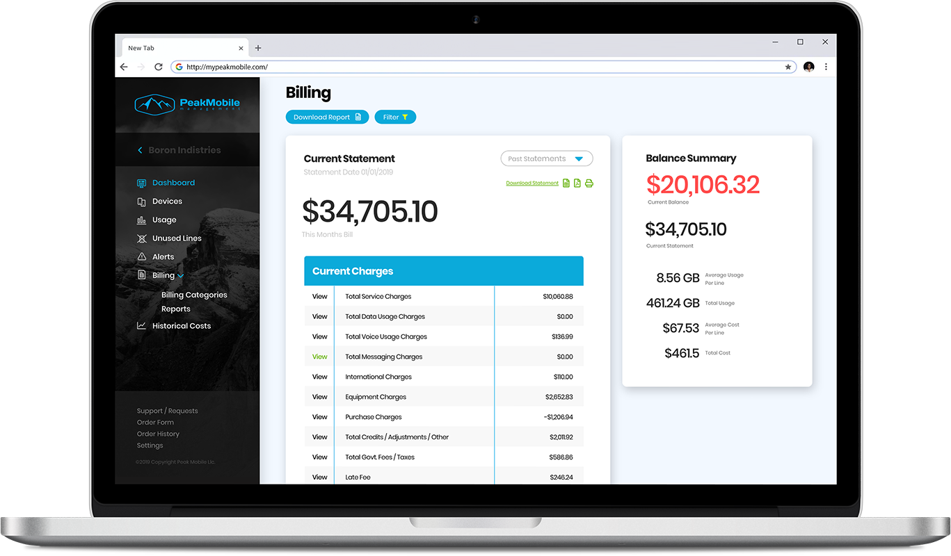
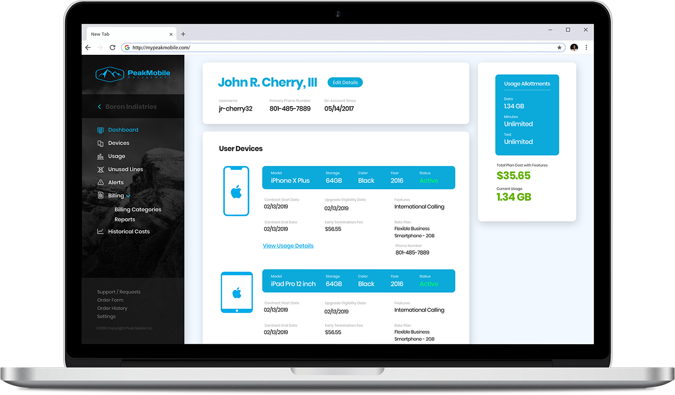
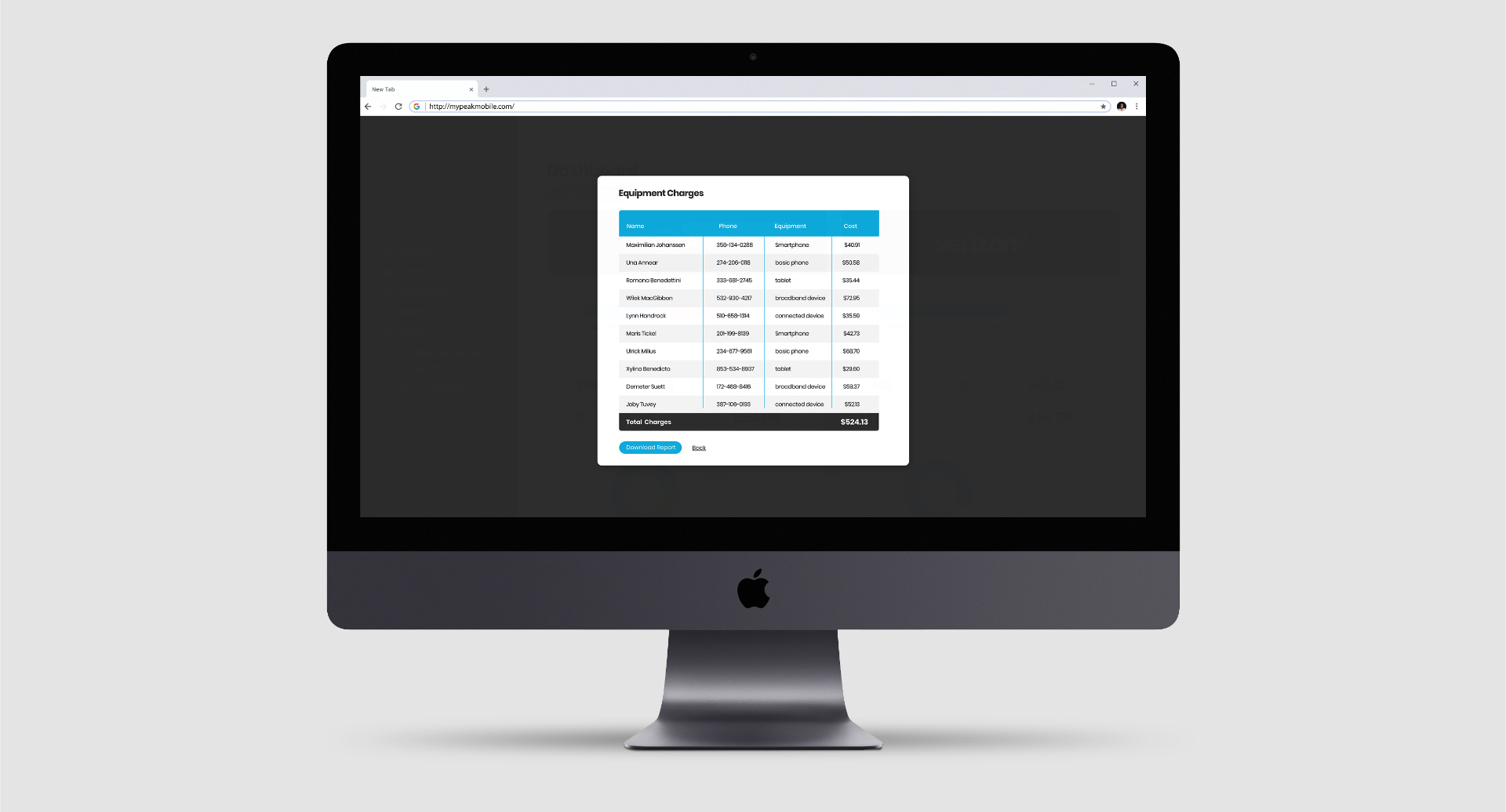
Goal 2. Give companies the ability to view all the devices they were paying for and allow them to easily create comprehensive reports for their billing.

User Flows

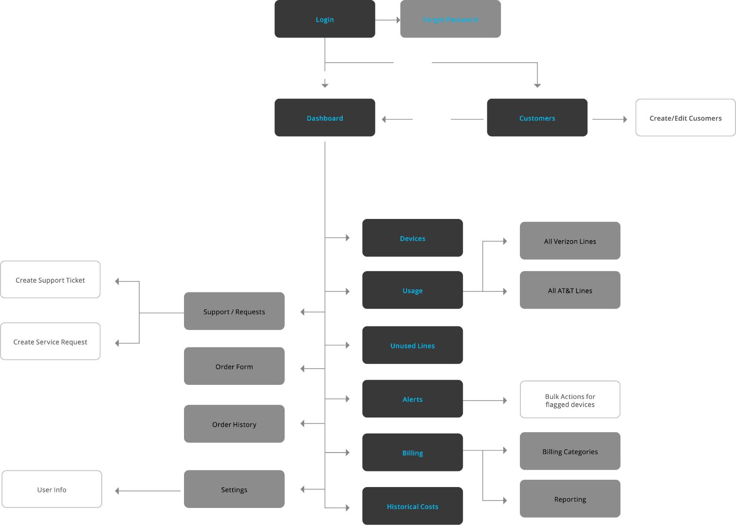
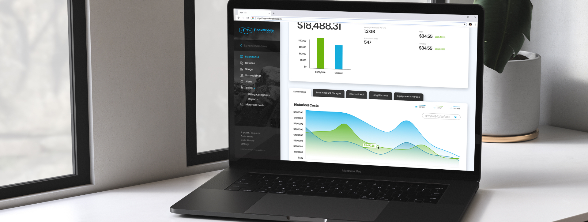
The PeakMobile app has a very simple process. Login and view your device usage and billing information. I started with some competitive research and looked through a variety of different platforms that would be expected to have a similar type of user experience. I logged into a variety of cell phone carrier billing portals, such as Sprint, and Ting. I noticed that a common theme was to have all the primary actions easily accessible in the main navigation. There weren’t many pages that you had to dig very deep to access. PeakMobiles existing navigation was overly complex and took users through a maze of actions to get where they needed to be. I simplified the user flow by having as few navigational elements as possible, and making all the primary pages visible on a sidebar nav.

Designing the UI

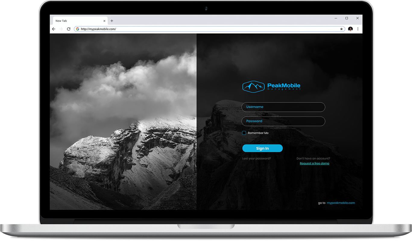
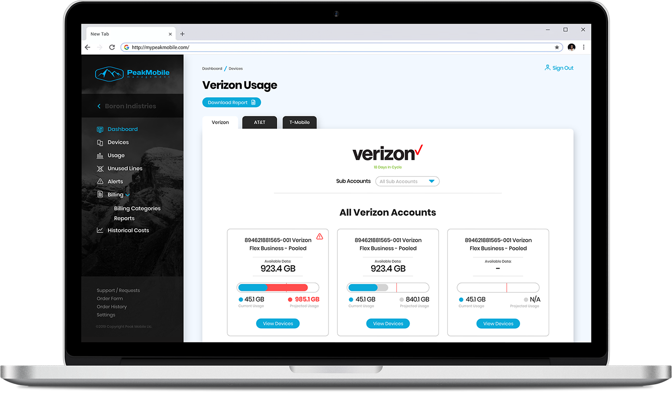
One of the most comprehensive UI packages I ever created was for peak mobile. It required many pages that needed to have consistent headers and sidebar menus. I had the opportunity to do a complete UI redesign and completely ditch every poor design element from the original web app. It There were a lot of color schemes that I was able to play with and many opportunities to use color theory for sending users messages. The final color scheme ended up using the Peak Mobile blue with a nice analogous green. There were tints and shades of each color used. The goal was to keep away from reds in the primary color scheme, because this was to be reserved for an alert color.

Sidebar and Iconography

I created quite a few versions and color variations of the sidebar to start. I wanted to see how far I could push the design aesthetic and guide the user to easily get to where they needed to go. The ultimate choice by the client was to use the sidebar with the mountain background which was also used in the login screen. I also needed to make a set of custom navbar icons that needed to be able to stand on their own at a very small scale. It was a challenge creating icons that were directly recognizable in relation to the page titles, while keeping them simple enough to be scaled quite small.

Responsive Designs

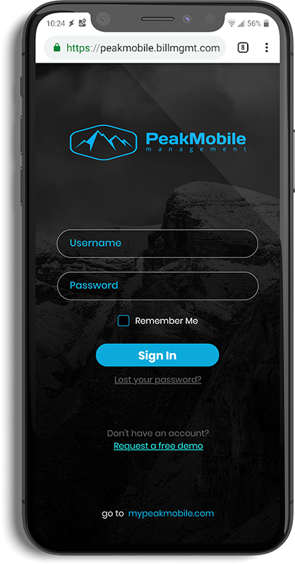
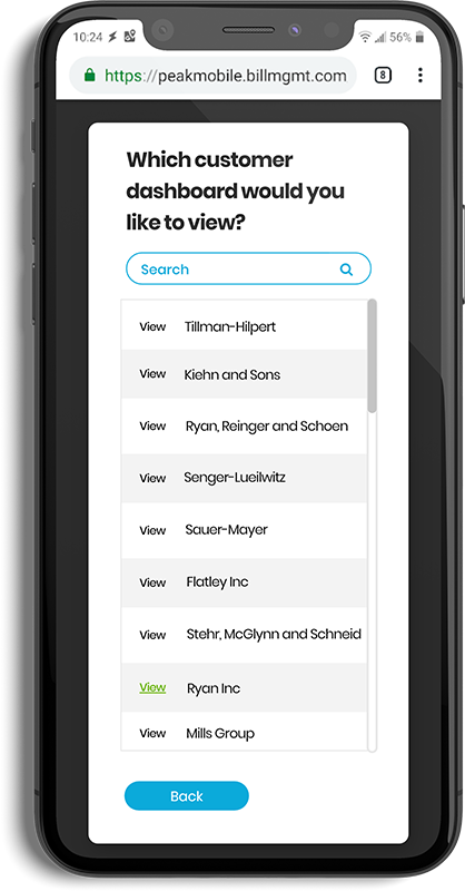
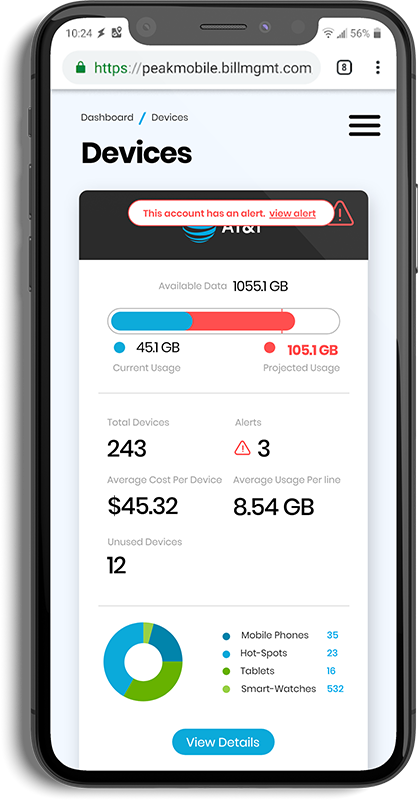
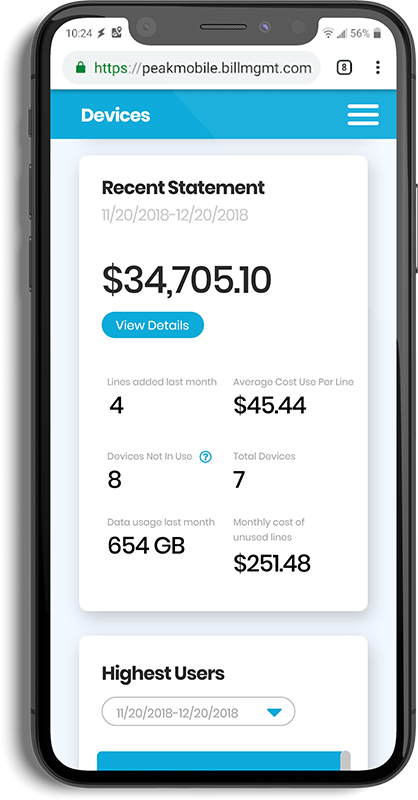
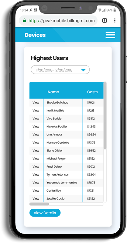
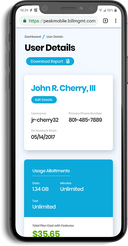
I finally created mobile versions of all the primary page template designs. Though this was a web app, it needed to look like it could be natively used on a mobile device. I already knew this during the desktop designing phase, so I created the designs so they could be easily transitioned to mobile views.