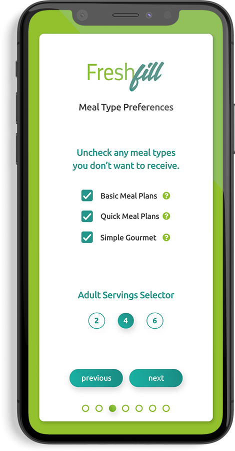
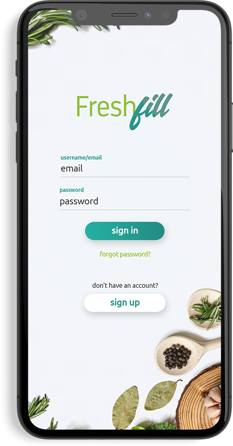
Freshfill Logo

FreshFill

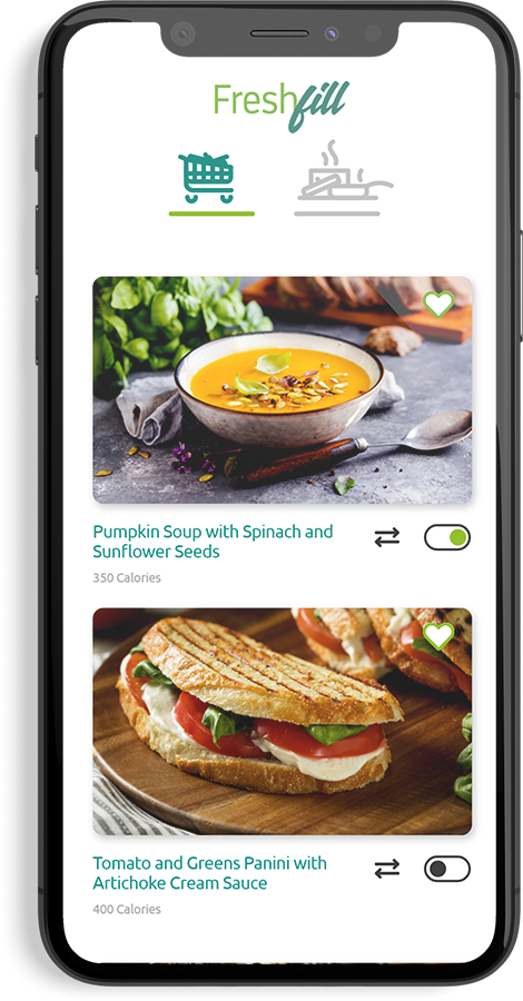
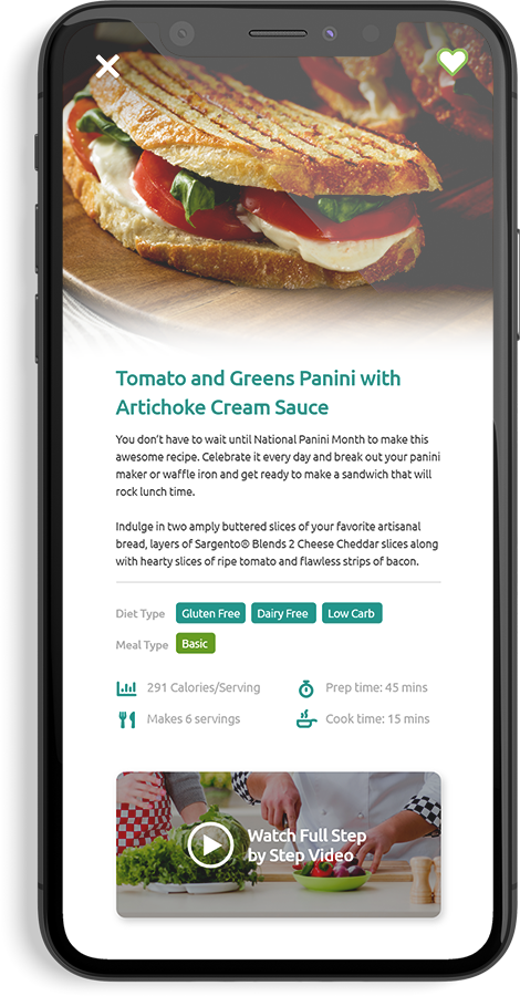
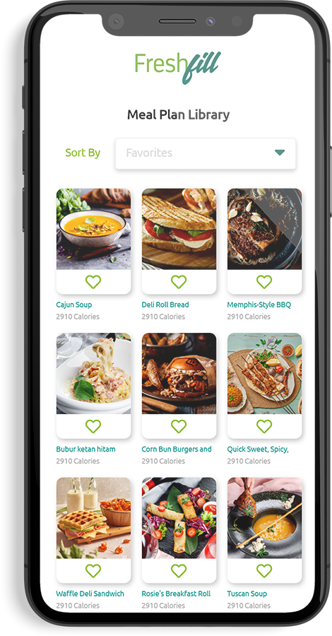
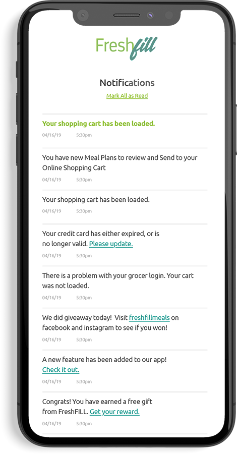
Delicious Inc. came to EKR looking to have a custom app built that would benefit their existing customers and allow them to enter into a new market. The primary purpose of the app was to provide users with 3 meal recipes each week, and allow them to automatically have the exact ingredients for each recipe loaded into an online grocer account. I was given a sitemap to work from and my role in the project was to create a pleasant experience for users that would fit the clients goals


Make the FreshFill logo appear “Fresh”

One of the first tasks I set out to accomplish was updating the logo. The existing logo had some usability problems and appeared a bit dated. The goal with updating the logo was to keep as much of the aesthetic of the original logo as possible, but make it appear modern, and clean. The Icon was also removed to allow the “FreshFill” wordmark to stand on its own.

Freshfill Logo Redesign

Rebuilding the FreshFill Icon

The logo icon was very important to the client so alterations had to be kept to a minimum. I recreated it to match the original icon, but the lines were cleaned up and given perfect symmetry where needed.

Logo and Spoon icon

Prototyping

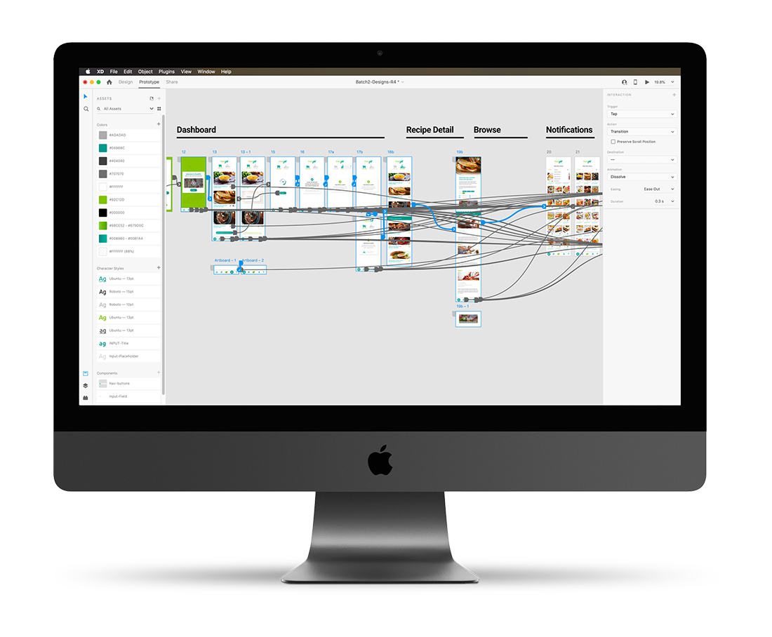
Creating a working prototype for the app was a vital part of the process to solving key problems that would arise. I created wireframes, and prototyped the design to study how people interacted with it. I was able to take notes on these experiences and make adjustments accordingly.

UI Animations

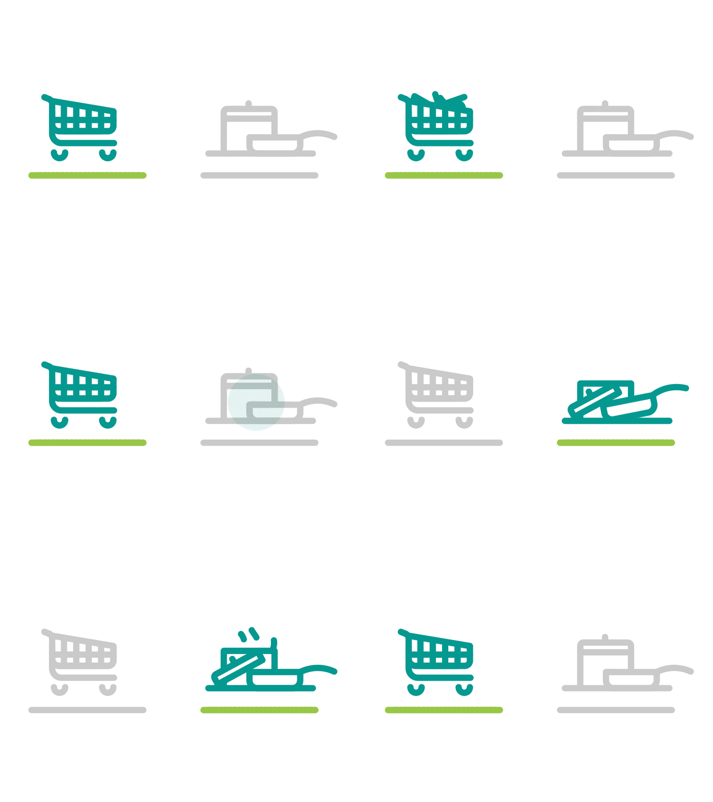
It’s sometimes the small animated elements that bring users that little bit of delight when using an app. I wanted to create something that would play off the idea of food. I created a looping animation that visually implied the top view of stiring of a pot of food. This loading animation is displayed for each page that needs to be loaded, or when the groceries are being uploaded to the users online grocer account. Another animation was created for the dashboard page. When a user toggles between the cooking page, and the available recipes page, the navigational elements animate.

App Icon

A persons first experience actually using an app always starts with the app icon. It is said that a chain is only as good as the weakest link, and to have a truly good experience, a user should never be allowed to have that experience tainted. Often, an apps icon is created as an afterthough. Usually the primary brand icon is placed in a rounded square and thats the end of it. My goal was to create an app icon that would act as a gateway for what was to come. I create a few variations with the idea in mind to create as much depth as possible to the icon and make it appear almost lickable. It required taking the logo icon, and using digital painting techniques to create reflections and shading that would give the icon depth.

Alternative Icons