Ciana

Ciana is a luxury custom lighting company. They create a variety of chandeliers and pride themselves on creating extravagant light fixtures that are mesmerizing and inspiring. They hired EKR and I was given the challenge to create a new brand. I love creating luxury brands and this was a prefect opportunity to create a beautiful lighting brand that would truly feel exclusive.

TOUCHPOINTS CREATED
  • Logo
  • Style Guide

Ciana Logo

Logos Presented

They decided to change their name to from B&B Lighting to Ciana (sēˈenə). Ciana was a perfect name because it had a nice symmetrical shape to the letterforms which made it seem to settle with a variety of possible logo icon shapes.


The name Liora had also been on the table as one of the potential options for the new name, so that direction was also explored. My primary goal was to create a logo that paired well with the wordmark and would emulate the look of lighting.


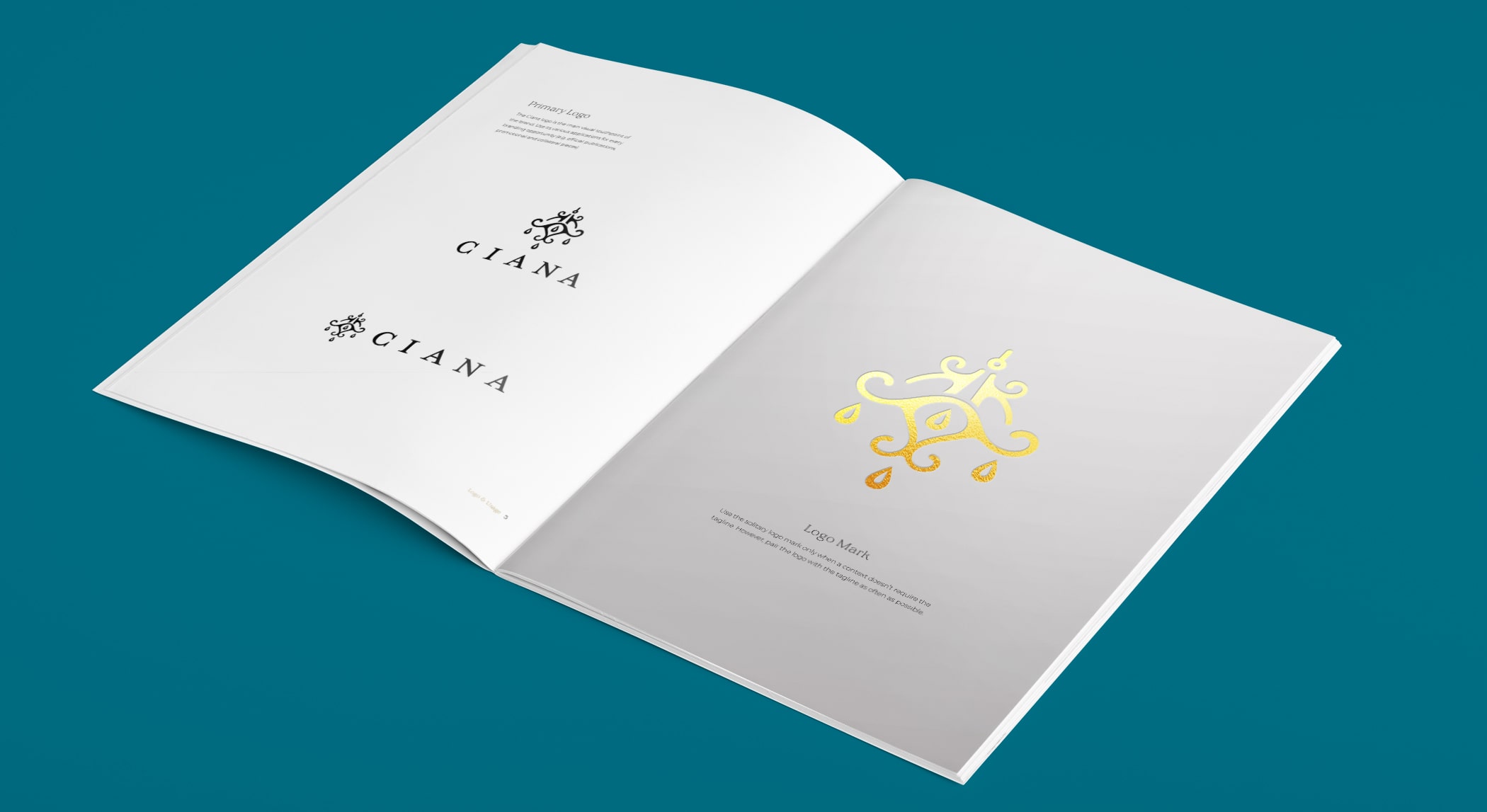
The final chosen logo perfectly fit the symmetry of a custom made light and had the elegant curves of luxury but the thickness and sharpness of a bold, high end, lighting company.

Chandelier Icons

Ciana wanted to emphasize their expertise in extragavant chandeliers. I set out to create a variety of logo icons that would feel luxurious and be representative of the Ciana’s vast array of production capabilities.

Ciana Chandelier icons

Color Variations

Ciana Logo

Ciana Lighting Logo

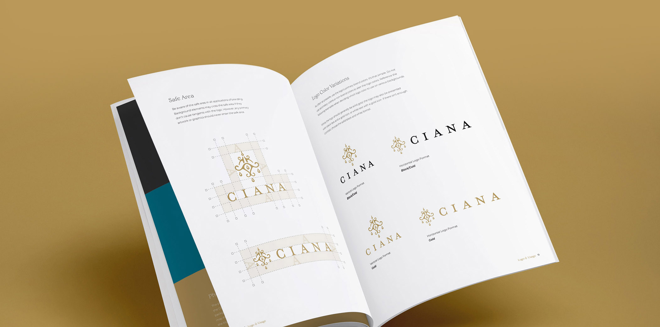
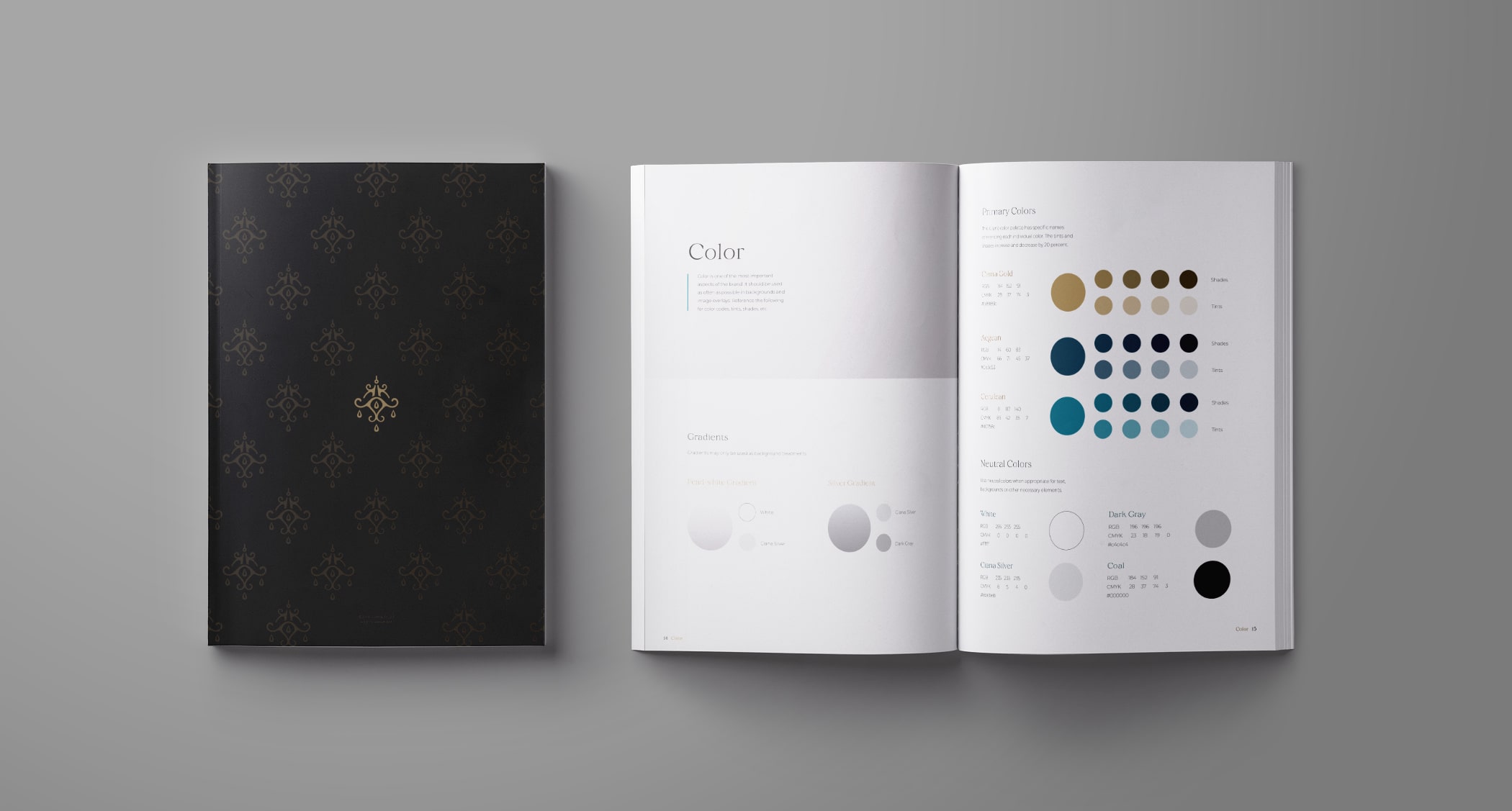
Ciana Style Guide

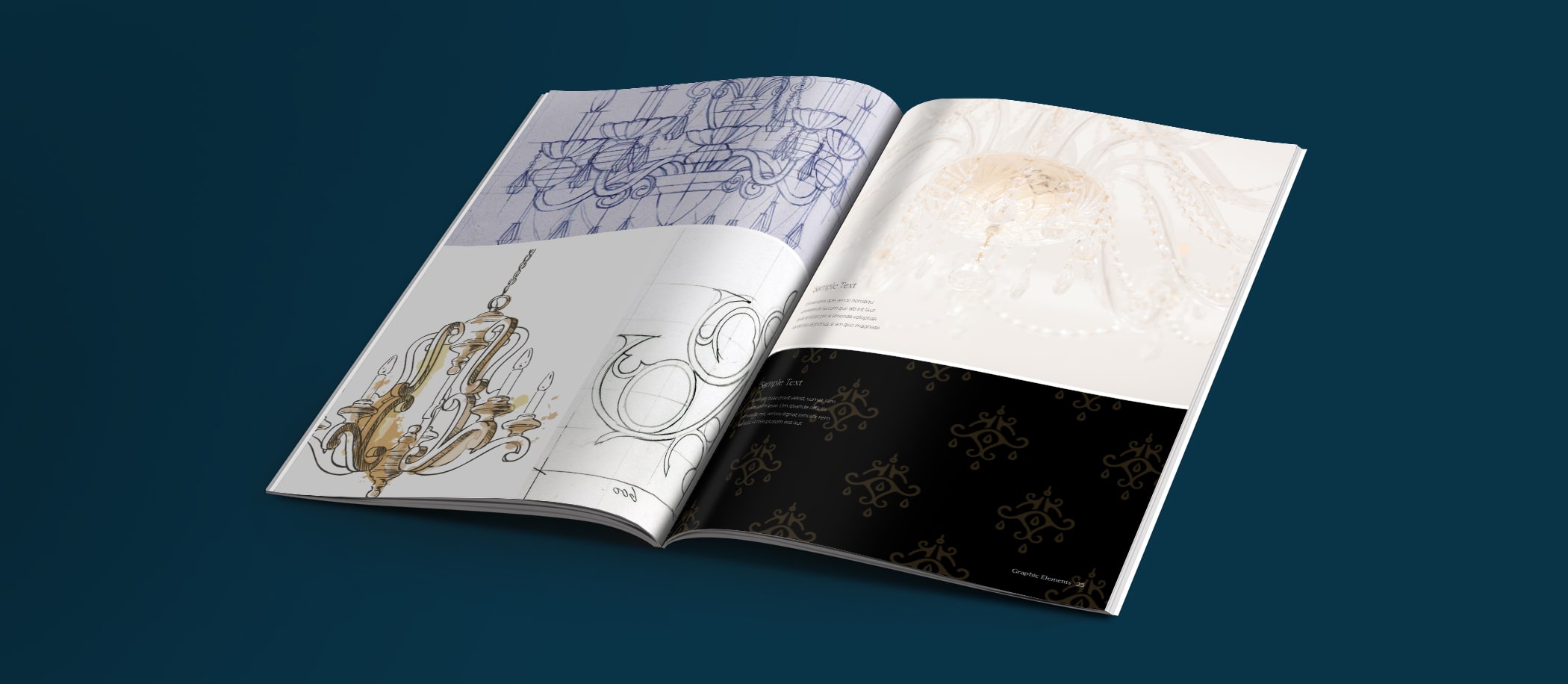
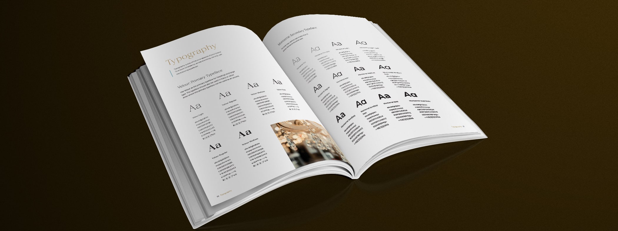
With so much that was put into the creation of the Ciana logo, a fitting style guite was needed to make sure nothing would stand in the way of keeping the brand pure. I created a style guide that featured beautiful chandelier imagery, tasteful uses of the logo. A variety of patterns, colors, icons, and styles tied everything together in a sophisticated style guide that would give the brand authority.