

Faves
I was a contract product designer for Faves from 2020-2023. While on that team, I supported product design strategy, created light and dark mode design systems, the entire 0-1 mobile app, branding assets, and prototypes.
The perfect design system for a startup
Faves had gone through many iterations of their app and with this had come lots of baggage with a variety of screens and elements. Amidst this ever-evolving process, we reached a crucial point where the idea of introducing both a light and dark mode for the app began to make perfect sense and was wanted by our users. It was an invaluable opportunity to establish consistency across all design elements and enhance work efficiency.
My first step was to take a few of the primary screens and create light mode versions of them since the default app existed in dark mode. With purple established as our primary color, I knew that lacking hover states in the app meant crafting a simple yet versatile color system was doable. It had to possess the ability to seamlessly adapt and expand over time, without falling into the trap of excessive complexity.
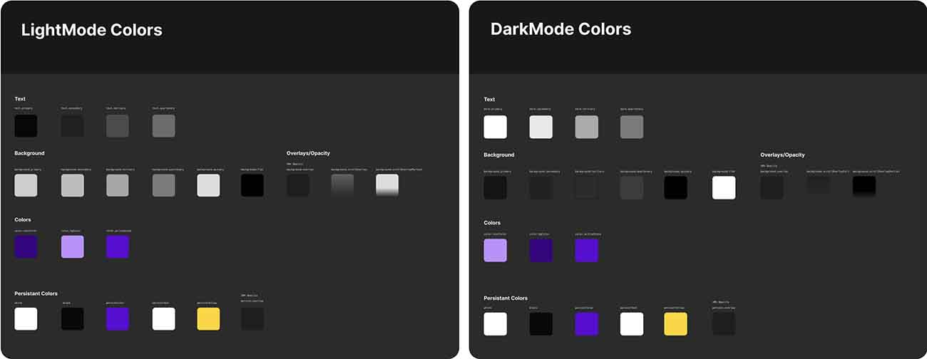
For the color system to work effectively, the light and dark mode colors had to match exactly in naming and format. I worked closely with the engineers and PM’s to establish a pattern for how the colors would be integrated into the code. This meant any time a color needed to be changed on the design system, the engineer didn’t have to repeat tedious amounts of work, and they could simply updated a variable in a json file.
Why not use Figma’s new variable system?
Figma recently released a new variables system which makes color management significantly more efficient. There is only one problem. Faves uses gradient overlays in a few areas of the app and Figma’s new system doesn’t support gradients. To use the Figma variables would mean to maintain two separate color systems simultaneously. While having a flexible and robust color system is important, maintaining it is of equal value.
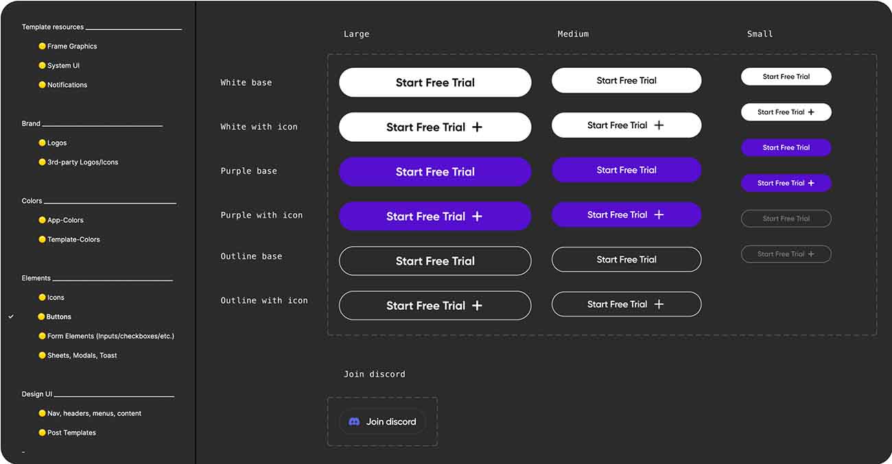
With the app being relatively small, I ensured that other pages in the design system were easily accessible and didn’t have large amounts of unused or unnecessary components.
Single source of truth
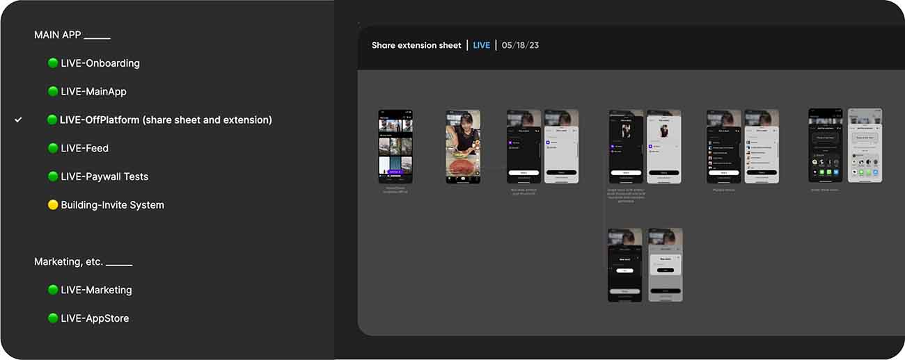
One additional vital aspect in improving company efficiency was creating a single source of truth document. Before this, quality assurance engineers regularly had a difficult time finding what to compare the live app to. Once I created a document with easy-to-access live pages those audits became immeasurably more effective and the live app UI matched the designs much better.
The design system is still evolving, but with the initial push of the design system and single source of truth document, internal team efficiency exploded as well as the growth of the company. During this time of improvements, the company ARR grew from $0 to over $1.3m.