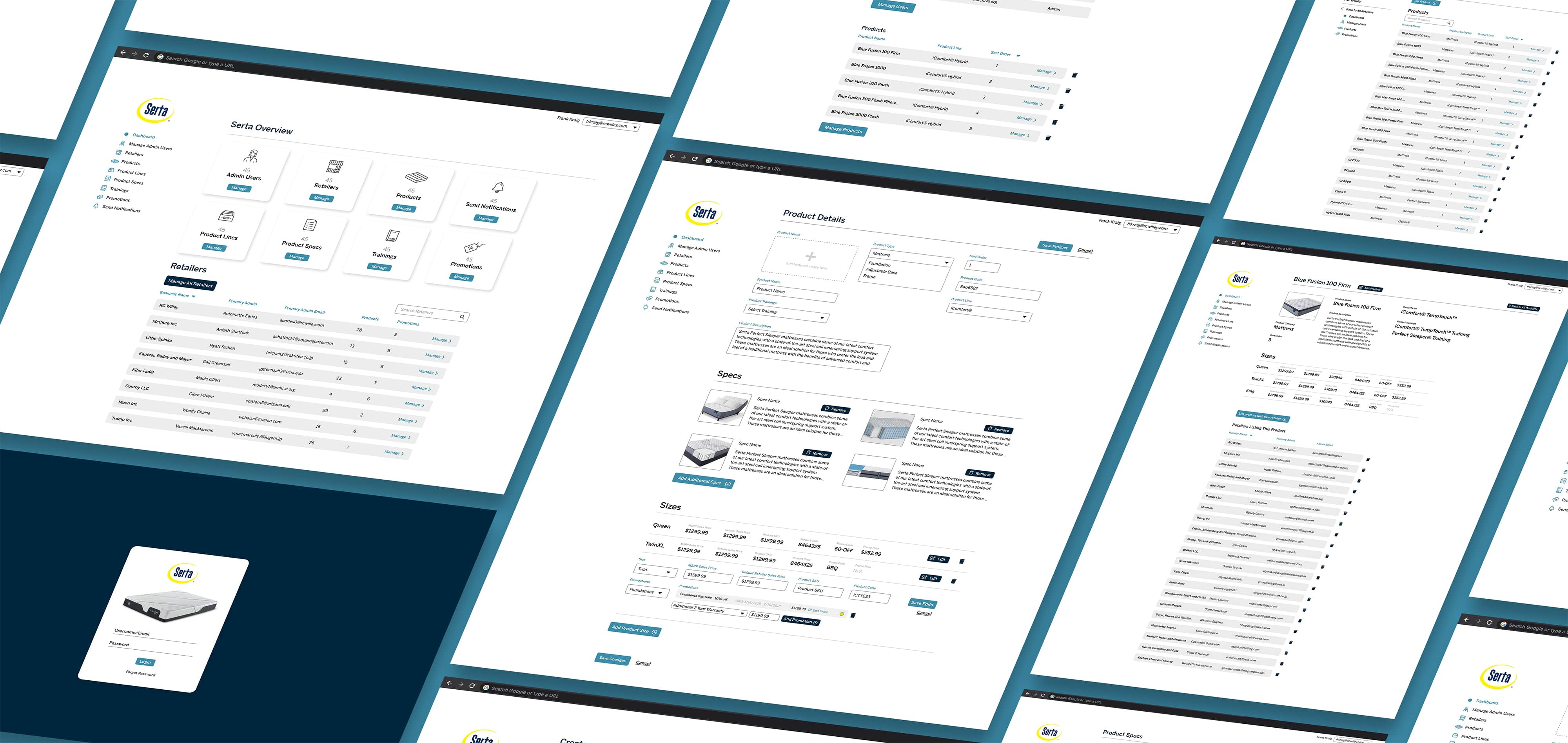
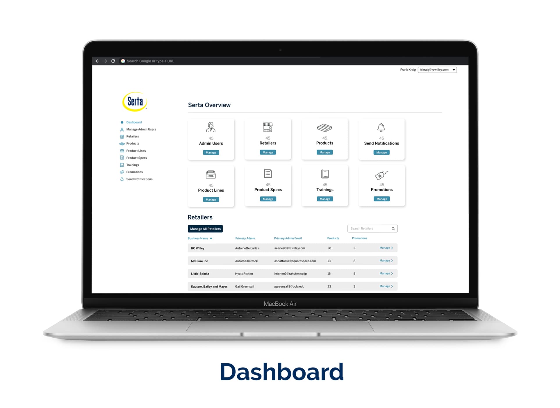
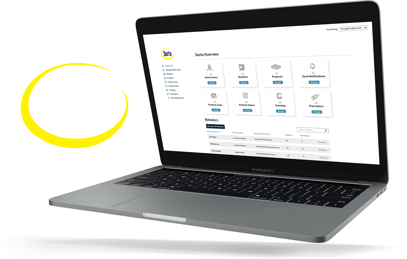
Serta Product Manager Web App

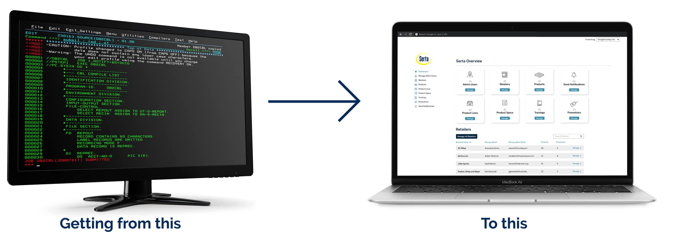
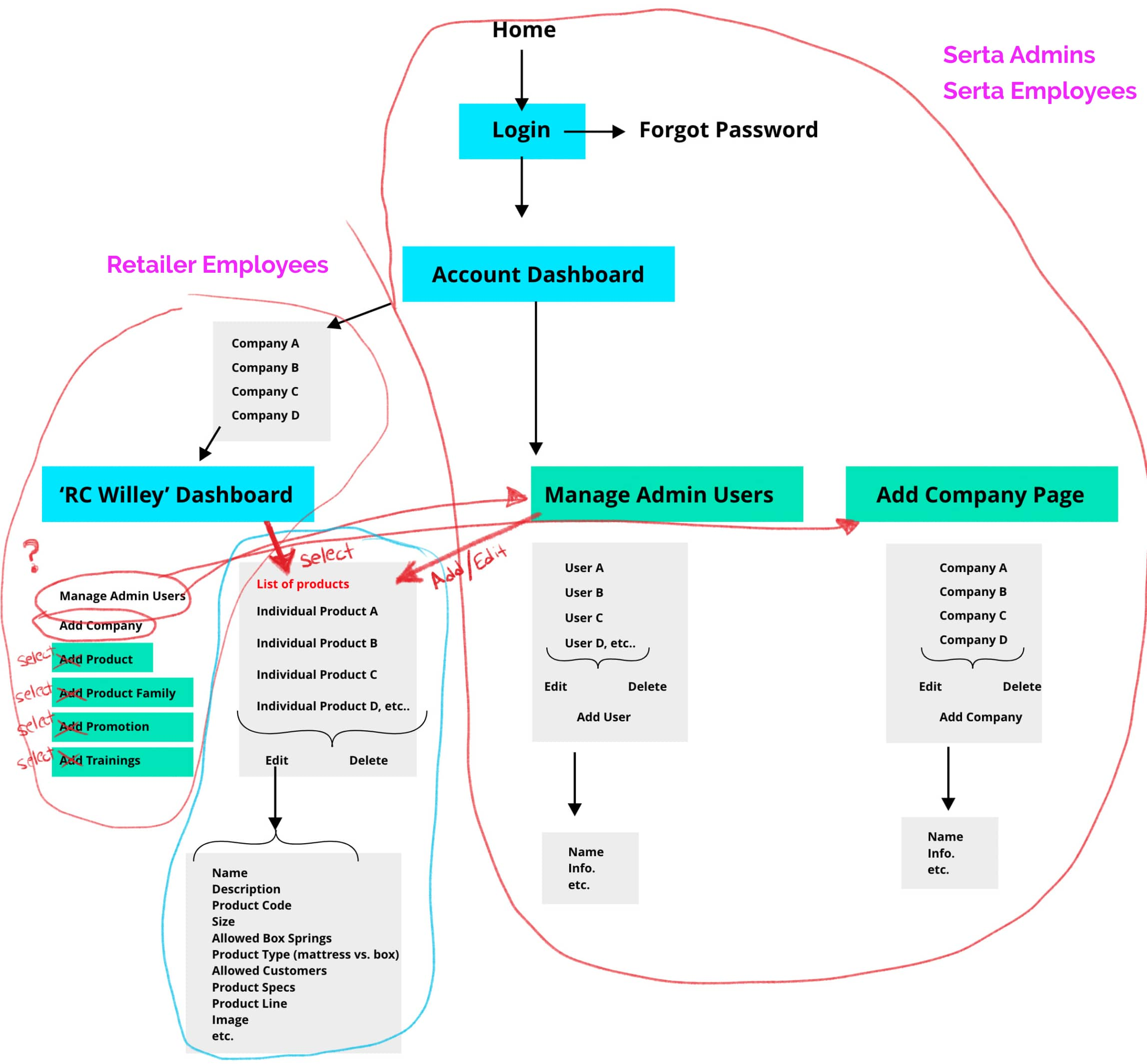
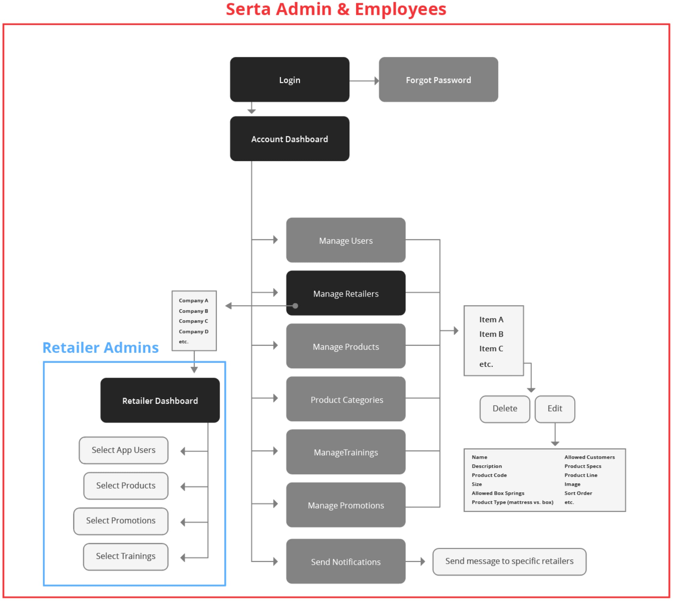
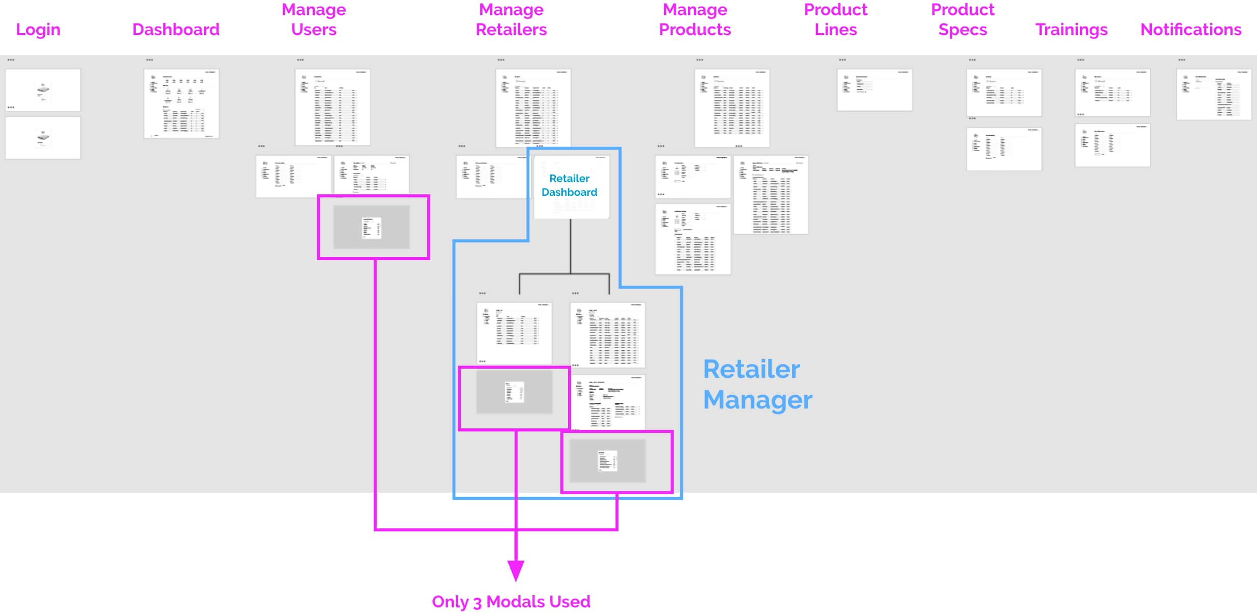
The western US Serta Division came to EKR to have a new web app created that would manage the data on their mobile app. I had the great opportunity to be placed over the project and I welcomed the challenge. Serta requires all retailers that sell their mattresses to use the RSAid Mobile app. This app provides retail associates with information for all the mattresses supplied by Serta. It allows associates to quickly view promotions, find product prices, and combine similar products to give quotes to customers.

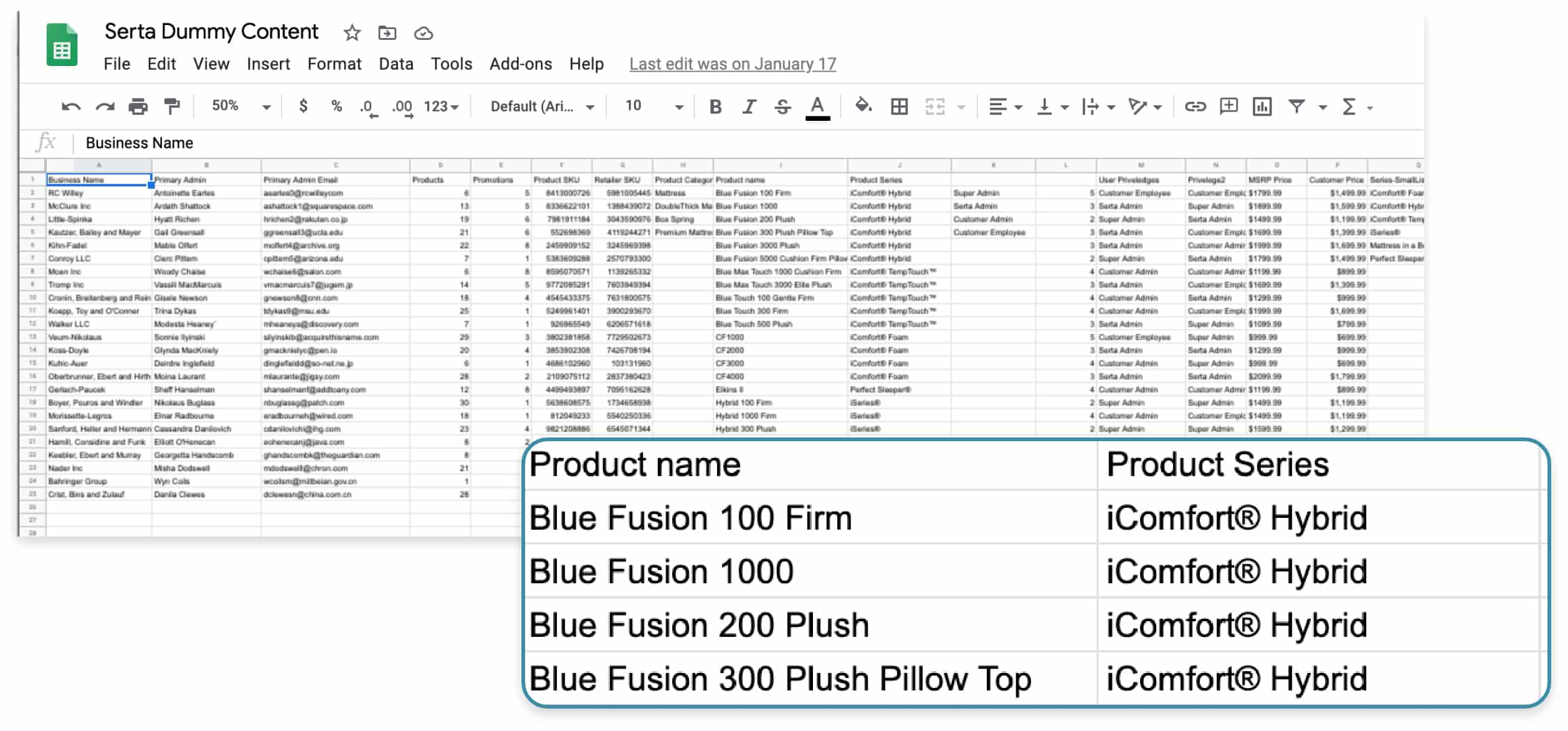
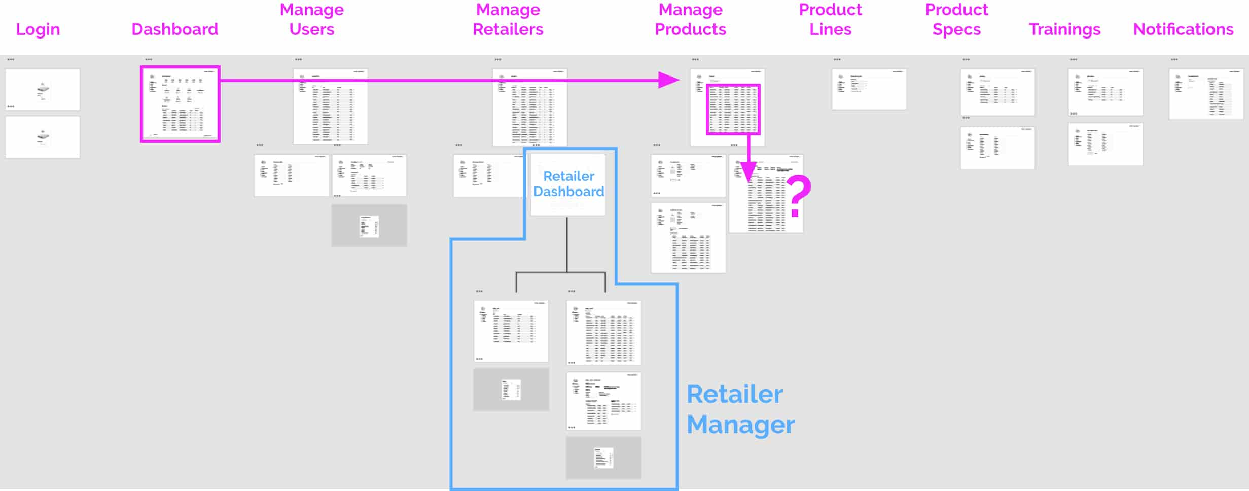
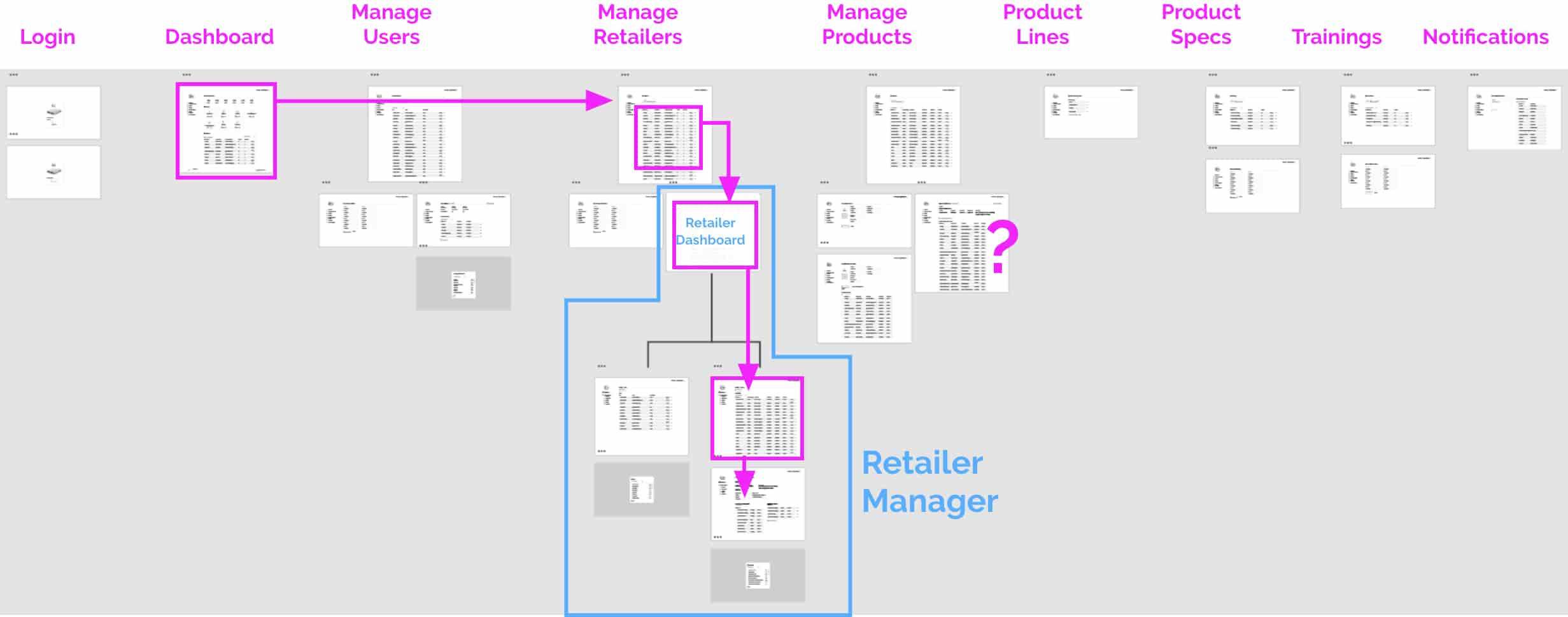
When Serta needed to make an adjustment to a product price or add a new product to the database, the process was manual and the adjustment had to be hand-coded into the database using an old programming language called COBOL. My role in the project was to design a simple to use web app that would allow Serta admins and employees to make those adjustments quickly and with flexibility.

Gathering Information.

My first step in the project was to get as much information from the client as possible. I needed information about their goals, the target market, and what their minimal viable product (MVP) needed to include. Below is the information I gathered.

Goals

  • Allow easy management of supplier products and retailer assigned products.
  • Create as dummy-proof experience as possible.
  • Ensure all original JSON data is accounted for.

Target Users

The users would be broken into 2 primary groups.

  • Serta Admins
  • Serta Employees
  • Retailer Admins (example: RC Willey Admins)
  • Retailer Employees (example: RC Willey Associates)

Project Constraints

  • 30 hour Budget for MVP design.
  • 2 week design deadline.

MVP Features

Create a UI that would allow easy editing of existing data.

Allow admins to send notifications to retailers.

Must have a separate dashboard for different user groups.

User Flow Creation

I took all the information from the original statement of work and simplified it into a list of all the pages that needed to be created. I compared this list to the database provided to me. It was difficult to make a comparison when the data differed so much in terminology and category names. To help with this, I parsed the database into easy-to-understand labels.

Statement of Work page list

Login
Dashboard
ManageAdmin
Create Company
“CreateProduct” Modal
“Create Product Family” Modal
“Create Promotion” Modal
“Create Training” Modal

Review Existing Database

Retailer Pricing
Retailers
Foundationpartnumbers
Mattresspartnumbers
Product Codes
Users
Product Sort Order
Product Lines
Product Categories
Promos
Sizes
Specs
Trainings

Review Existing App

I communicated with the lead project engineer and discussed the plan to collect and manage the data. I was given a json file that had all the data that would be used in the project. With the database information organized, I compared it to the existing app, to understand how the data was being used. I took note of the primary and secondary pages, and how the content on the app was organized. I put all the information into a spreadsheet and ensured the developer had it for future cross-reference.

Reorganizing The Data Into User Groups

To create the initial user flow, I broke up the data into groups separated by each users permissions. I defined the requirements of each group and quickly created a rough flow so I could visualize what parts of the database each group needed to access. The Serta admins had access to all the app features, and each group had access to each subset of features.

Combine all data into a rough flow map

Using the page list from the project scope of work, and the data I organized into the user groups, I created a rough sitemap. I knew it didn’t have all the information needed, but time was of the essence and I need to quickly iterate through information to create a solid sitemap. I noted the missing information and gathered feedback from the client and project manager. While showing the rough sitemap, I pointed out that the data that I hadn’t yet included. I got information from the client and the project manager as to where that would best fit in the flow map.

Initial Rough Flow Map

Restructured Flow Map

I used the feedback obtained and restructured a new user flow. I was originally planning on combining the retailer information in the primary navigation, but learning that the retailer admins would need their own dashboard, I split the app into two sections. The most common task for Serta users would be global edits. It wouldn’t be as common for them to make retailer-specific changes, so the retailer dashboard was split into its own section of the app. When retailer admins logged in, they would only see that dashboard.

Most Modals Were Removed

Modals are not very scalable for large amounts of data. They can help simplify complex apps that involve many different pieces, but since this app was relatively simple, I didn’t want to create unnecessary modals. The data could be easily added into pages instead. Additionally, one of the primary goals of the app was to be “As dummy-proof as possible”. The target audience included a variety of age groups, but an older, and less tech-experienced audience would be on the forefront.

Wireframing & Prototyping

Since the project was on a tight budget and deadline, I only had essentially 2 rounds of wireframes to get a usable MVP delivered. The wireframes had to be fairly high fidelity to translate it to a usable design, quickly after approval.

Pre-Wireframing Research

Before getting too far into wireframing, I researched a few articles to get some inspiration from problems others have had and how they solved them. This would put me in a good mindset. Often designers go first to inspiration resources such as dribble or Behance. I wanted to get some UX inspiration based on actual experiences which is why I prefer using actual case studies.

Best practices for dashboard design
What UX designers should know for dashboard design
Accessibility design for dashboards
UX dashboard practices
Dashboard design case studies

I also looked at various existing web apps to get inspiration on simple interfaces that would solve the client’s problems. I am a long time user of Hello Sign and their interface seemed to fit the Serta user’s needs almost perfectly. I used this app as a large part of my inspiration.

Based on best practices for building admin web apps, the app was designed with the primary navigation on the left, with the user account access in the top right. On the dashboard, I added multiple options for a user to navigate to the various pages. This would make the app even more dummy-proof, especially for first-time users.

Dummy Content

When testing digital products, often users get distracted by filler text and data that doesn’t appear real. I used Mockaroo and google sheets to create lists of fake data that matched the type of data from the original JSON files.

Creating & Testing Scenarios

The plan was to test scenarios using a prototype in the first round delivery with 2-3 actual Serta employees. to ensure I could provide the best possible MVP in the second round. These tests with the Serta employees would provide valuable feedback and insights. I didn’t want to be wasteful by testing actions that would reveal obvious flaws in the system on the “real employee’s”. I could find solutions to problems of that nature much sooner. I created a few scenarios using the initial prototype and ran some casual tests with coworkers. I made some astute observations that I was able to improve the prototype before the first round of ‘REAL’ tests.

Scenarios Tested

Scenario 1 summary: Create a new Serta product and assign it to a retailer.

The first task was to be the most common task the app would be used for. Create a new product in the Serta database, and assign it to specific retailers. The user would start on the login screen and have to work their way through each page to accomplish the task.

Scenario 1 results:

The first task seemed simple for each user I tested it on. They clicked through each page as expected. Most users were initially slightly confused once they had completed the product creation process. I had expected this and added a quick shortcut on each product page to allow the product to be assigned to retailers directly on the product page. It only took a second for them to notice the button that said “List product with retailers”.

Actions Taken:

I found that users paused the most when reading through the actionable buttons. Buttons such as back, create product, and edit were difficult to differentiate. To help with this I added Icons next to the word on each button and tested the prototype again. I found that adding the icon significantly sped up the time it took for users to differentiate the buttons.

Scenario 2 summary: Update a product price for a specific retailer.

Most often, retailers for Serta products use the default pricing. Occasionally a retailer will need a specific price for a given product. This task required a person to navigate to the retailers dashboard from the Serta admin page and make that change accordingly.

Scenario 2 results:

1st pass: Fail

2nd pass: Success

I found that when a user was new to the app, the first page they would navigate to when changing a price unique to a retailer, was the products page. The user would attempt to edit a product and quickly realize that there was no way to make that price unique to a retailer because it was a global product price change. When performing a few tests, I found that almost every person had the same outcome. When each person would start the task over, they would recognize the retailer’s option and go directly to the correct pages to complete the task.

Actions Taken:

I realized that based on the functionality of the app, there wasn’t enough time to create a better solution without changing the navigation of the app. I realized that for the user correct their own error on their second attempt, it wasn’t a big enough problem to address for the MVP. The user would only have to learn this flow once, and it would be easy enough to remember in the future. I took note of the potential friction this could cause for the user and added it to the backlog to be addressed once the MVP was completed.

Other Scenarios Tested

  • Create new training and assign it to a retailer’s product.
  • Edit product typo.
  • Edit product price for a specific retailer.

UI Design

Most of the time for the project was spent in the UX phase, and there wasn’t much more time to explore concepts for the UI design. In order to have the deadline met, I used the Serta branding elements provided to me, and I colored everything to look

Custom Icons

Based on the feedback from some of the user tests, I created custom icons (some based on an icon pack) that would be easy to recognize and would communicate the action for each navigational element. They needed to be scalable to very small and relatively large sizes. These icons would also reinforce better accessibility to a wider range of user types and ages.

serta-customicons

serta-customicons

Final Designs

After I ran some additional tests, I was able to clean up the wireframes a bit and add some color which resulted in the final designs below.